Examples of My Work
CJ Speedway
Boogity, boogity, boogity! Let’s go… developing? CJ Speedway Promoter Brian Neal approached me to revamp the aging website for the local dirt oval race track in Columbus Junction, Iowa. It was his first year as promoter and he wanted to make some deeper branding changes, although he didn’t really have any of these ready. So I used the race track’s new logo to extract some design elements and choices. I developed an innovative method to display the rules for all six weekly race car classes and incorporated an easy-to-update news component. I even added a quick way to update fans and drivers on pending weather conditions, because as all race fans...
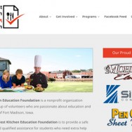
Read MoreTest Kitchen Education Foundation
When my enthusiastic friend and long-time customer, Kumar Wickramasingha, asked if I wanted to build a website for his new venture, I jumped at the chance! Who could blame me? The idea was a novel one for Fort Madison… The Test Kitchen Education Foundation is a non-profit organization to fund the Elliott Test Kitchen. ETK gives kids a place to go after school to work on and get help on schoolwork from teachers and volunteers, as well as hang out with friends while eating tasty food cooked by kids learning from an award-winning experienced chef! The challenge was to create a nice looking site that was responsive (so it looks great on mobile devices, too) and could...
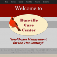
Read MoreDanville Care Center
The kind folks at Danville Care Center wanted a website designed to reflect the look of their current marketing materials. I created a site with their unique look and styling, but made sure the result was easy to maintain and administer. WordPress was the perfect answer to this challenge, as it allows clients to add, remove, and change content on the site without having to wade through code to do so. This website is flexible enough to be a long-term solution for Danville Care Center and will be able to grow with them. danvillecc.com
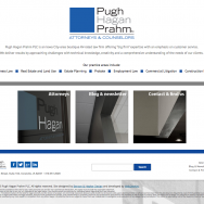
Read MorePugh Hagan Praghm
PughHagan.com was another collaborative effort with the amazing Robyn Hepker of Benson & Hepker Design! Robyn created an interesting design for a law firm — not the easiest thing to do, by far — and I made the design come alive. The most interesting aspect of the site, in my humble opinion, is the way the information about each attorney is presented. Instead of smacking you in the face with a bunch of words listing accomplishments or education, we tucked everything nicely away behind a clickable link. If you want to know more, it’s easily available. And once again, I used WordPress as a platform to make it easy for the client to maintain areas of...
Read MoreTony Wolfe Insurance Services
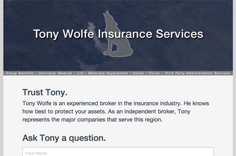
Tony Wolfe came to me asking for a very simple website. He wanted a one-page site that would allow potential and current clients to contact him easily. And he wanted it quickly. So the result is a fresh one-page design that incorporates a nice, easy-to-use web form. The results of the form are sent directly to Tony so that he doesn’t have to remember to go somewhere to check for messages coming in from his website. Quick, reliable communication with his clients was the result. tawins.com
Read MoreMuscatine School Orchestras
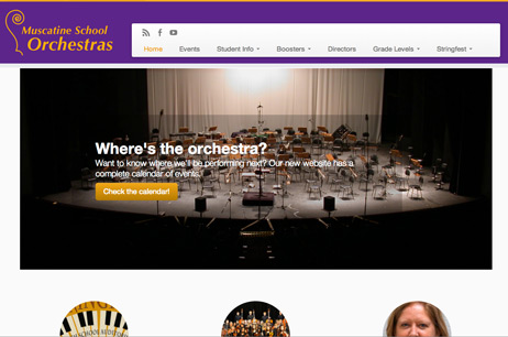
The Muscatine School Orchestras Booster Club was looking for a fresh start for their new website. They had an old site that hadn’t been maintained and needed a new look. The list of desired features was long and the timeline was short, so I rolled up my sleeves and got started. From the ground up, I wanted this to be a responsive site (one that adapts to the device’s screen size). The result was a WordPress-based theme that looks great on any device. The navigational menu disappears into a menu button for mobile devices, saving screen real estate and focusing on the content. Speaking of content, the client has full control of most every aspect of the site....
Read More


